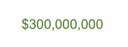
Is Your Login Form Costing You $300 Million in Additional Sales?
If your conversion rate isn’t as good as you think it should be, maybe you should sit back a minute and look at things from the point of view of your potential customers. Could you be making a 300 million dollar mistake? One company utilized online marketing specialist Jared Spool to increase the number of customers purchasing from them by 45% resulting in a gain of more than $300,000,000 in the first year after making the change. Here’s Mr. Spool’s story:
The form was simple. The fields were Email Address and Password. The buttons were Login and Register. The link was Forgot Password. It was the login form for the site. It’s a form users encounter all the time. How could they have problems with it?
The problem wasn’t as much about the form’s layout as it was where the form lived. Users would encounter it after they filled their shopping cart with products they wanted to purchase and pressed the Checkout button. It came before they could actually enter the information to pay for the product.
The team saw the form as enabling repeat customers to purchase faster. First-time purchasers wouldn’t mind the extra effort of registering because, after all, they will come back for more and they’ll appreciate the expediency in subsequent purchases. Everybody wins, right?
“I’m Not Here To Be In a Relationship”
We conducted usability tests with people who needed to buy products from the site. We asked them to bring their shopping lists and we gave them the money to make the purchases. All they needed to do was complete the purchase. We were wrong about the first-time shoppers. They did mind registering. They resented having to register when they encountered the page. As one shopper told us, “I’m not here to enter into a relationship. I just want to buy something.”
Some first-time shoppers couldn’t remember if it was their first time, becoming frustrated as each common email and password combination failed. We were surprised how much they resisted registering. Without even knowing what was involved in registration, all the users that clicked on the button did so with a sense of despair. Many vocalized how the retailer only wanted their information to pester them with marketing messages they didn’t want. Some imagined other nefarious purposes of the obvious attempt to invade privacy. (In reality, the site asked nothing during registration that it didn’t need to complete the purchase: name, shipping address, billing address, and payment information.)
Not So Good For Repeat Customers Either
Repeat customers weren’t any happier. Except for a very few who remembered their login information, most stumbled on the form. They couldn’t remember the email address or password they used. Remembering which email address they registered with was problematic – many had multiple email addresses or had changed them over the years.
When a shopper couldn’t remember the email address and password, they’d attempt at guessing what it could be multiple times. These guesses rarely succeeded. Some would eventually ask the site to send the password to their email address, which is a problem if you can’t remember which email address you initially registered with.
(Later, we did an analysis of the retailer’s database, only to discover 45% of all customers had multiple registrations in the system, some as many as 10. We also analyzed how many people requested passwords, to find out it reached about 160,000 per day. 75% of these people never tried to complete the purchase once requested.)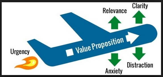
The form, intended to make shopping easier, turned out to only help a small percentage of the customers who encountered it. (Even many of those customers weren’t helped, since it took just as much effort to update any incorrect information, such as changed addresses or new credit cards.) Instead, the form just prevented sales – a lot of sales.
The $300,000,000 Fix
The designers fixed the problem simply. They took away the Register button. In its place, they put a Continue button with a simple message:“You do not need to create an account to make purchases on our site. Simply click Continue to proceed to checkout. To make your future purchases even faster, you can create an account during checkout.” Those simple changes made an extra $300,000,000 a year possible.
The moral to the story is, if your product is relevant, if the urgency is high and the risk is low, then the two fixable things you should be working on to increase your rate of conversions are clarity in your messaging and avoiding distractions in the purchasing process. Sure trust seals have been proven time-and-time again to increase sales when prominently displayed on the check-out page, but often it’s just putting yourself in the shoes of your visitors and making their buying experience more pleasant.
To find out more about Jared Spool, the genius behind the $300,000,000 change, visit his site: https://aycl.uie.com/